We’re proud to have an opportunity to hold a workshop at #LAK18. In the workshop we will together create analytics dashboards – based on data that you will provide.
Before the conference, workshop attendees will be given a concept map template, built around LAK18 conference programme. Attendees will be asked to complement the concept map template with their knowledge, experiences and emotions about the themes in conference programme.
For the workshop, we will aggregate data from all these complemented concept maps, thus creating a dataset to analyze. We use the conference programme as a way to familiarize us to the technology constraints and possibilities. In addition, we will co-design new approaches creating dashboards for students, teachers, programme leaders and management. From another point of view we will utilize agile hands-on development with our sample data and design ideas for other types of dashboards as well.
Concept map analytics, in our case, started from a rather other direction than dashboards. Spring 2016, Professor Jani Romanoff in Marine Technology introduced Ville with a problem: students were not providing enough feedback. Teachers were getting steady 30% response rates through rigid feedback forms after the course. For sure, this is a big problem for someone who wants to become a better teacher. An idea of a more dynamic feedback system started to formulate.
First funding application
Window of opportunity came when Aalto University launched call for ideas to advance online learning in Aalto University. With some seed funding the problem was defined and the idea of a prototype was launched in December 2016. Idea was to make a concept map of curriculum content, give it to students as a template and ask students to update the concept map weekly. They could add comments to curriculum content, find relationships between content of different courses and add information about their progress. Teachers could then look at the concept maps to get insights about students’ thinking.
From concept to reality
Pilot was funded again for 2017 to start small scale piloting. During year 2017 concept maps were piloted in 8 courses. Also one learning assignment made use of this methodology.
Both students and teachers were extremely happy with the new method. “Teachers’ actually care about us learning!”, one student commented in an interview after the course.
Aggregate, aggregate!
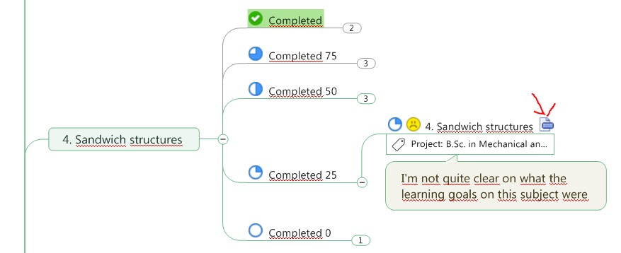
It became clear quite soon, that it is very time consuming for teachers to go through tens of concept maps weekly. We needed a way to get an overview from contents of multiple concept maps at once. As a short term solution, we used a plugin within the mapping software (example of teacher’s view).
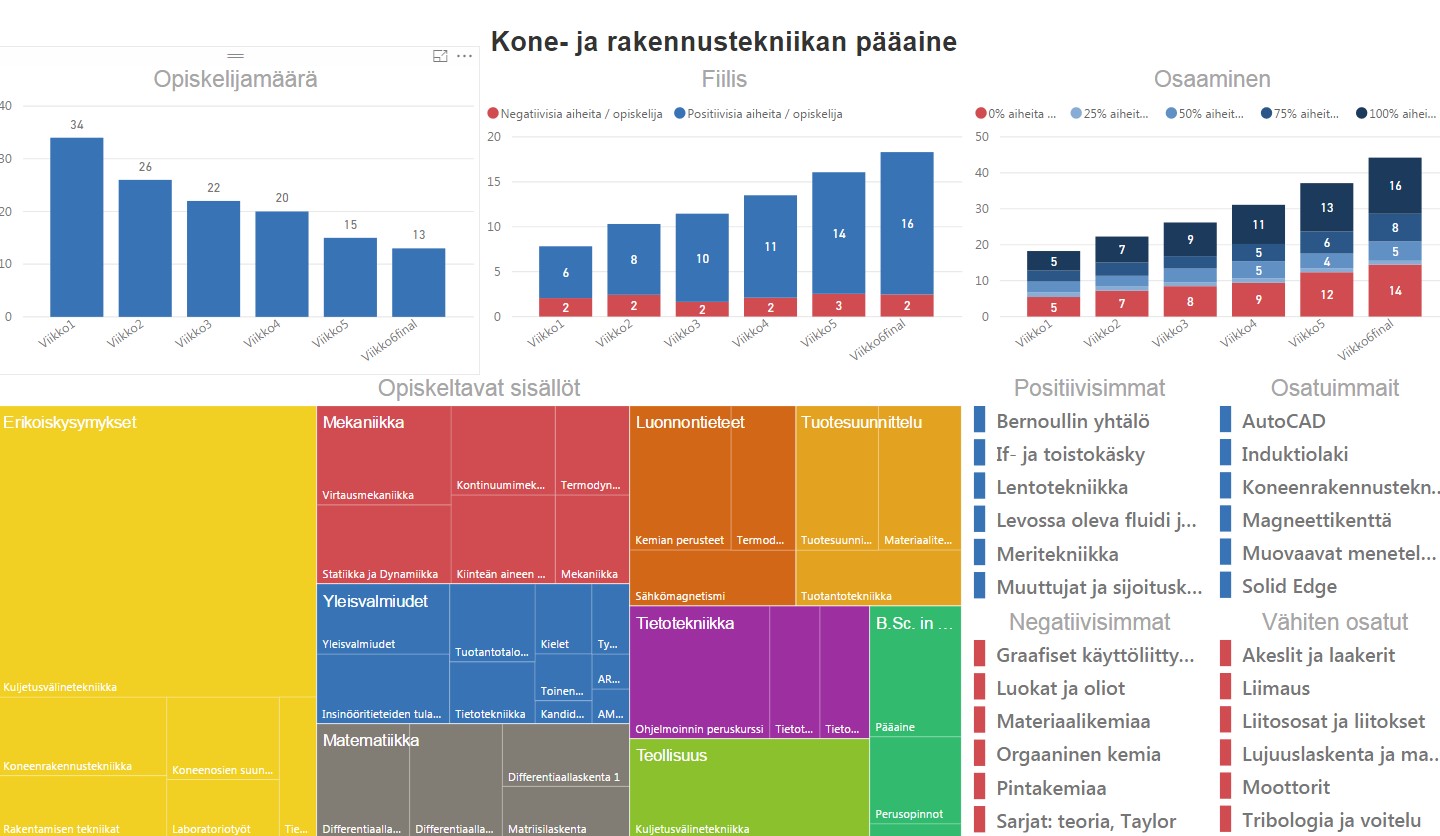
In autumn 2017 a more sophisticated aggregation method was built. We wrote a little program which parsed relevant information from multiple concept maps into CSV-files. Then, an analytics dashboard was built using those files and Microsoft Power BI.
Future plans
In near future the dashboard and automation will be developed to meet the needs for more dynamic response for teachers.
Next year another set of courses will join the pilot. The pilot is also negotiating with a full degree programme in Master’s level to take part in piloting starting 2018. Plans include deeper integration with Aalto University’s Learning Management System (Moodle), Student Information System (Oodi) and Data Warehouse.
