Time goes by, publications get attention, metrics accrue. Or do they? To find out what happens locally in small scale and in a short time frame, in one year, I re-queried the Altmetric API and WoS for our items at VIRTA. The results are visible behind the Data by School tab of the aaltovirta web application – but not all of them, just (possible) changes in tweet(er)s, Mendeley readers, and WoS citations.
While at it, I also added links to open access full texts found by the oaDOI service API. The roadoi R package was very helpful in this. Currently, roadoi is about to become a member of the rOpenSci suite. I was gladly surprised when I was asked to participate in an open peer-review of the package. Revamping the app with oaDOI information acted as a timely proof for my part that roadoi does what it promises.
There are a multilple ways to visualize changes over time. At first, I had in mind to try to show as big a picture as possible in one go, i.e. all items by School. However, most Schools publish several hundred items per year. Not easily consumable unless you have a megalomaniac full-wall screen, swim within data in VR, or some such. Only the research output of the School of Arts, Design and Architecture (ARTS) was within realistic limits.
Small multiples
Below are three images showing changes in ARTS publications in citations, tweets, and Mendeley readers, respectively. Here I used the facet_wrap function of the ggplot2 R package, with much-needed extra help from Visualizing home ownership with small multiples and R by Antonio S. Chinchón. My version of his code is in this gist. Before plotting, data is sorted by the value of the respective metrics.

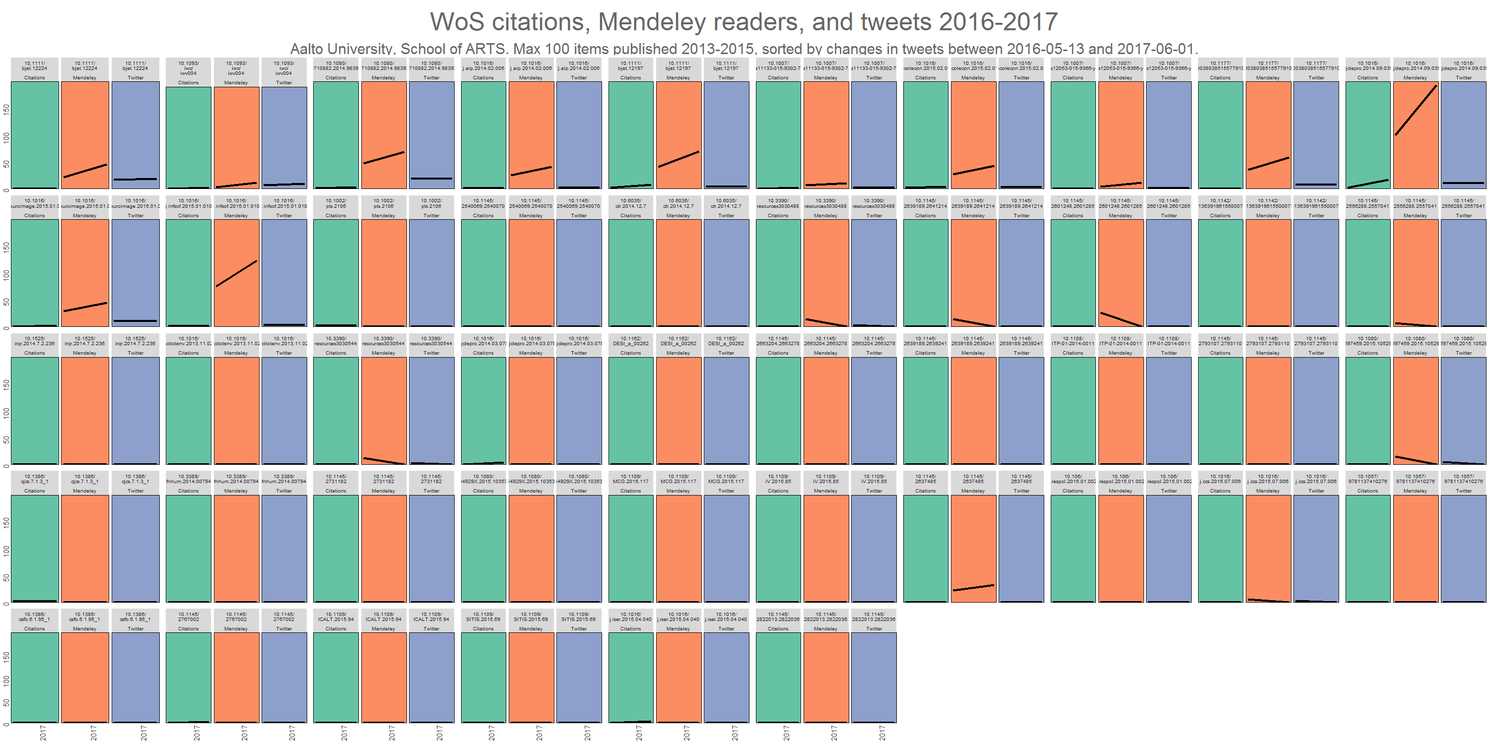

Note that some values have decreased during the year, mostly in Mendeley. What this probably just means is that at query time, data was missing.
We know that it takes some time for citations to accumulate. Still, even one year can make a difference. In this ARTS sample, Addressing sustainability in research on distributed production: an integrated literature review by Cindy Kohtala had 2 citations in spring 2016 but now already 16. At the same time, Mendeley readership doubled from 95 to 184, whereas the number of tweeters remained the same, 10. This is a familiar pattern. Twitter is more about communicating here and now.
In all ARTS publications, only three had more tweeters now than a year ago. The increase is so small though, that you cannot decipher it from the pictures due to scaling.
- Mobile apps for reflection in learning: A design research in K-12 education (+2)
- Shuffling services: Current trends in interacting with digital music (+2)
- Collaborative futuring with and by makers (+1)
Of course it would be interesting to know, at which exact times these additional tweets were sent, by whom (human or bot), and what might have triggered the sending. CrossRef Event Data is now in fresh beta. Some day we may get detailed information via their API to the first question, for free. As for now, I find the API results still a bit confusing. Based on example queries, here I’m asking for events of the first item from the above list http://query.eventdata.crossref.org/events?rows=10&filter=work:10.1111/bjet.12224. For reasons I don’t understand, there are no mentions of that DOI among the first 10 rows. Anyway, we need to be patient – and read the documentation more carefully.
For the record, in the whole Aalto set, the paper that saw the most increase both in tweeters (14) and Mendeley readers (153) during the year was Virtual Teams Research: 10 Years, 10 Themes, and 10 Opportunities from the School of Science (SCI). On the Altmetric detail page we can see that the newest tweets are only a few days old. The way Journal of Management acts as an amplifier for its own article archive certainly plays a role here.
What about citations? The biggest increase in them took place in the School of Electrical Engineering (ELEC). A Survey on Trust Management for Internet of Things had 35 citations last year, now 134.

Small multiples are known to be useful in detecting anomalies. In the above ELEC picture for example, on the 3rd row, there is something odd with the 7th item from the left. Turns out that there are two items in the data with the same DOI, but the publication year differs. My process didn’t expect that to happen.
Sparklines and colored cells
The main venue for all the data in the current and previous exercises on (alt)metrics has been a table in the Shiny web application. A multi-colum, horizontally scrollable beast built by DT, an R interface to the DataTables JavaScript library. Visualizing changes over time in there, inside table cells, asks for either sparklines or some kind of color scale. I tried them both.
I have only two time data points, so the result lines lack their familiar, playful, sparkling appearance. Basically, mine are either 45 degree slopes or 2D lines. Still, they were fun to implement with the sparkline htmlwidget. Big thanks to SBista for advice!
Colors work great in heatmaps where you have a big canvas with many items. Also calendar heatmaps are fine. Again, a table is perhaps not the best platform for colors, but I think that even here they manage to tell part of the story. To be on the safe side, I used 3-class Spectral by ColorBrewer.
DT is versatile, and it comes with extensive documentation. The number of columns in the table is bordering its maximum, so I used some helper functions and extensions to ease the burden. Hopefully the user experience is not too bad.