Since the previous posting, the Scholarly Article Citation dataset on Figshare has been upgraded to include also DOIs. Great! I’d imagine that unlike with PMIDs, there’d be more coverage from Aalto with DOIs.
Like in all altmetrics exercises so far, I first gathered all our articles published since 2007 and having a DOI, according to Web of Science. I also saved some more data on the articles such as the number of cites and the field(s) of science. This data I then joined with the Figshare set by the DOI field. Result: 193 articles.
Which research fields do these articles represent?
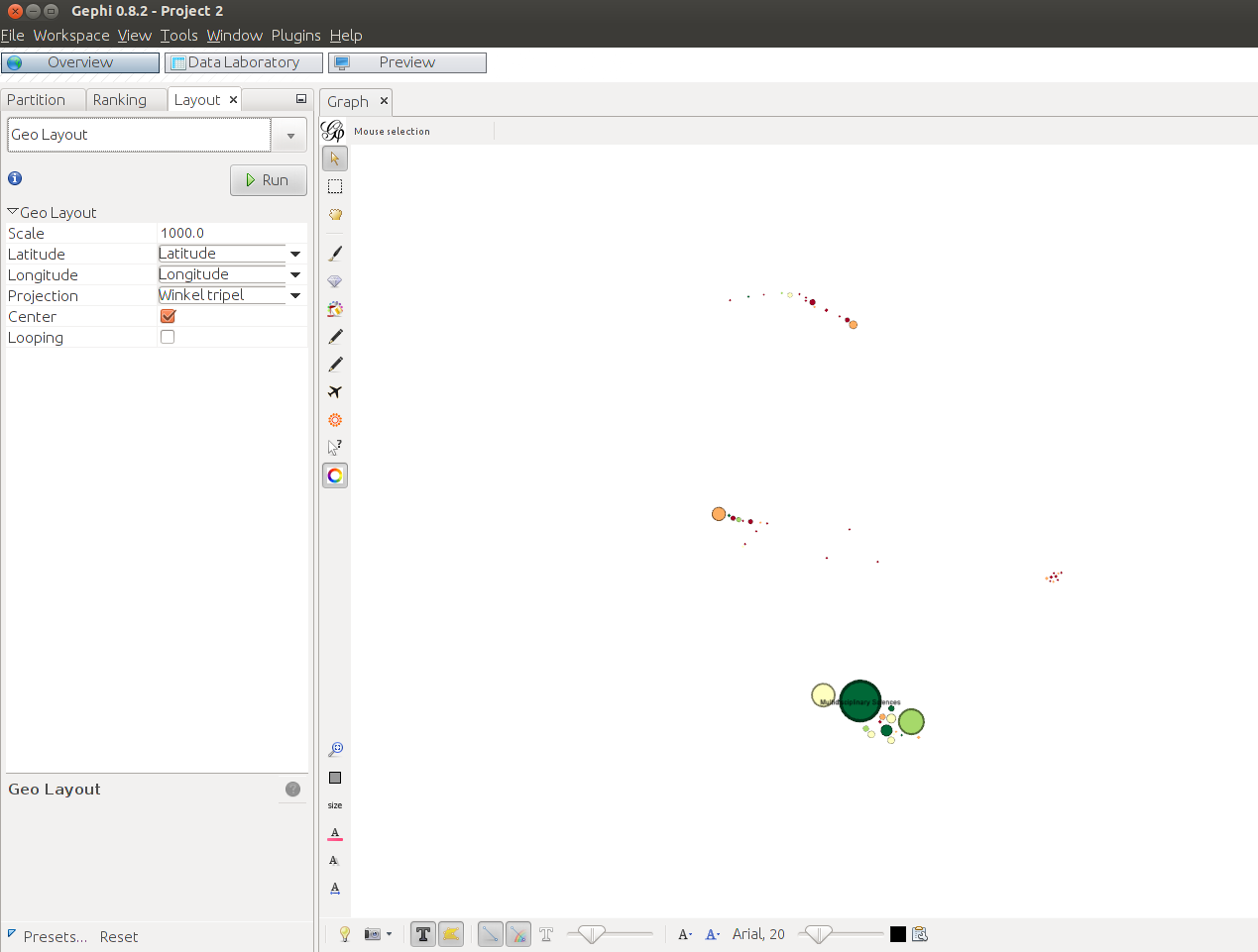
Web of Science makes use of five broad research areas. With some manual work, I made a lookup table where the various subfields are aggregated onto these areas. Now I could easily add the area name to the dataset by looking at the subfield of the article. To make life easier, I picked only the first field if there was more than one. Within each area, I then calculated the average citation count, and saved also the number of articles by area (group size). With these two values, it was now possible to construct a small “network” graph; node size would tell about the article count within that area, and node color the average number of citations. But how to keep the areas as ready-made clusters in the graph, without any edges?
A while ago I read about a neat trick by Clement Levallois on the Gephi forum. With the GeoLayout plugin, you can arrange nodes to the canvas based on their geocoordinates, using one of the projections available. As a bonus, the GEFX export format preserves this information in the x and y attribute of the viz:position element. This way, the JavaScript GEXF Viewer knows where to render the nodes.
 .
.
What coordinates to use, where to get them, and how to use them? A brute force solution was good enough in my case. One friendly stackoverflower mentioned that he had US state polygons in XML. Fine. What I did is that I simply choose five states from different corners of the US (to avoid collision), and named each research area after it. For example, Technology got Alaska. Here’s the whole list from the code:
nodes.attr$state <- sapply(nodes.attr$agg, function(x) {
  if (x == 'Life Sciences & Biomedicine') "Washington"
  else if (x == 'Physical Sciences') "Florida"
  else if (x == 'Technology') "Alaska"
  else if (x == 'Arts & Humanities') "North Dakota"
  else "Maine"
})
Then I made two new variables for latitude and longitude, and picked up coordinates from the polygon data of that state, one by one. Because polygon coordinates follow the border of the state, the shape of the Technology cluster follows the familiar, elongated shape of Alaska. A much more elegant solution of course would’ve been to choose random coordinates within each state.
One of the standard use cases of Gephi is to let it choose colors for the nodes after the result of a community detection run. Because my data had everything pre-defined, also communities aka research areas, I couldn’t use that feature. Instead, I used another Gephi plugin, Give color to nodes by Clement Levallois, who seems to be very active within the Gephi plugin developer community too. All I needed to do, is to give different hexadecimal RGB values for ranges of average citations counts. For a suitable color scheme, I went to the nice visual aid by Mike Bostock that shows all ColorBrewer schemes by Cynthia Brewer. When you click one of the schemes – I clicked RdYlGr – you get the corresponding hex values to the JavaScript console of the browser.

From the last line showing all colors, I picked both end values, and three from the middle ones. To my knowledge, you cannot easily add a custom legend to the GEFX Viewer layout, so I’ll add it here below raw, copied from the R code.
nodes.attr$Color <- sapply(nodes.attr$WoSCitesAvg, function(x) {
  if (x <= 10) "#a50026"
  else if (x > 10 && x <= 50) "#fdae61"
  else if (x > 50 && x <= 100) "#ffffbf"
  else if (x > 100 && x <= 200) "#a6d96a"
  else "#006837"
})
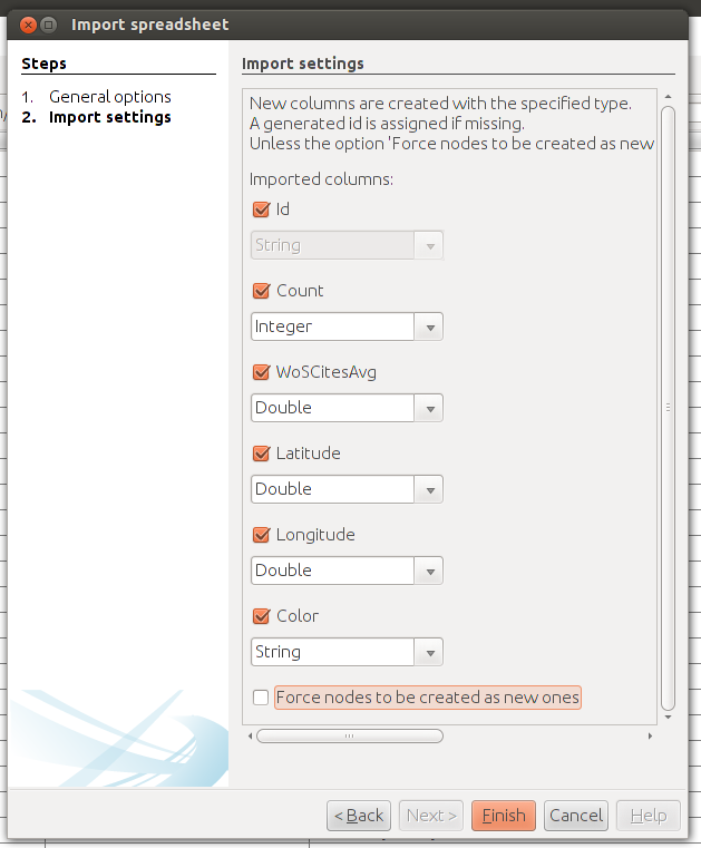
From the data, I finally saved two files: one for the nodes (Id, Label, Type), and one for the node attributes (Id, Count, WoSCitesAvg, Latitude, Longitude, Color). Then, to Gephi.
New project, Data Laboratory, and Import Spreadsheet. First nodes, then attributes. Both as node tables. Note that in the node import, you create new nodes, whereas in attribute import, you do not. Note also that in the attribute import, you need to choose correct data types.
First I gave the nodes their respective color. The icon of the new color plugin sits on the left-hand side, vertical panel of the Graph window. Click it, and you’ll get a notification that the plugin will now start to color the nodes.

Nodes get their size – the value of Count in my case – from the Ranking tab.
When you install the GeoLayout plugin, it appears in the Layout dropdown list. I tried all the projections. My goal was just to place the different research area clusters as clearly apart from each other as possible, and Winkel tripel seemed to produce what I wanted.
Finally, bring node labels visible by clicking the big T icon on the horizontal panel, make the size follow the node size (the first A icon from the left), and scale the font. A few nodes will inevitably be stacked on top of each other, so some Label Adjust from the Layout options is needed. Be aware though that it can do all too much cleaning, and wipe the GeoLayout result obsolete. To prevent this from happening, lower the speed from the default to, say, 0.1. Now you can stop the adjusting on its tracks whenever necessary.
Few things left. Export to GEFX; install the Viewer; in the HTML file, point to the configuration file; in the configuration file, point to the GEFX file – and that’s it.
It’s hardly surprising I think that multidisciplinary research gets attention in Wikipedia. Articles in this field have also gathered quite a lot of citations. Does academic popularity increase Wikipedia citing, too? Note though, that because the graph lacks the time dimension, you cannot say anything about the age of the articles. Citations tend to be slow in coming.
For those of you interested in the gore R code, it’s available as a GitHub Gist.